Sunday 8 December 2013

Food Branding Finished Designs One

Food branding in my eyes was a flexible task which would allow me to take my project wherever I wanted to. The first task was to determine what food I would like to carry out. My idea was weird food so everything on the stall would have unusual combinations. The logo process was quite long but when desiging I wanted to carry out an indepth study to ensure the most effective logo. Once I came to a point of resoloution I added selections of chocolate to the logo to emphasise the menu which tailors mostly to chocolate. The finish result added to different items however was to vague and was not relevant in my eyes therefore My next task was to create a simpler food choice and tailor the logo to it as necessary.

As part as my research I was lucky enough to visit the Pop art exhibition at the Barbican. The barbican itself has a really amazing brand identity which I could moniter, the bins, coatroom and the walls were all a brand this made me think about how I could possibly take my project. It did inspire me because I was able to think about the importance of packaging as well as the colors that radiate from all the art work. I think the colour combinations were the inspiration point which I took back with me when working on my project. As well as the Barbican we went to an outdoor food market where we could see first hand existiing stalls and branding which I found really helpful. There were little touches such as skeletons hung up and wheelbarrows all little things which made the brand stronger and gave it a character. It is important to remember the company I am branding is a small foodstall therefore these characteristics are important.


I really like the above logo exploration because it really allowed me to explore the different combinations and choices which form my logo could be. I tried to plaay around with kerning, overlaying, colour and opacity. I enjoyed doing this and was eager to see how the two 'w' could interact with eachother. I like the way ths page is laid out and I hope this process is something I carry on doing throughout this foundation course. One aspect I really like is the colour combnations i think they compliment eachother very well and interact nicely.

This is my final logo in order to add some relevance to the chocolate idea I added chocolate melting from the top of the 'w' I like this feature becauase it adds character to the logo and also breaks up any sharp lines. The Logo can work with the circular design or on its own seen below in the apron form. Below you can see that the apron transends from the apron which I think is a really nice touch. The brand indenity is clear to see. The typeface for the brand is  gill sans condensed as I feel this makes the brand quirky and matches the kookiness of the brand's concept.

Above you can see the stall design created on Illustrator. I wanted to keep the carnival feel going on so I created a sort of freakshow inspired stall. The colours use the brand logo etc, and the brand expression of the geometric shapes are clear to see. Usin them keeps the whole brand tied together. Over all I really like this design and I think that the stall stands out and works with the grittiness of the London landscape. The only thing which I wish the logo was slightly more visble as I set the logo opacity quite low.

Above you can see the sticker design which would be used to seal the boxes in which the food would be packaged in. I wanted the geometric shape to be used to keep the identity. I chose to use a colourful palette so that the carnival- weirdness was brought out within even the packaging. However althouh I like the sticker designs above I think perhaps I should try to narrow down the options which are visible above. Below is the vest designs which could be worn by employees and sold. I think that the lighter colour works better on the red instead of the navy and is perhaps something I should change and ensure loks better.


Updated Food Branding
After my crit I was given constructive critisim as well as alot of praise. One of the points was to hint the brand as a food stall rather than leaving it less obvious. I agreed as I personally feel the logo could be applied to many industries such as clothing instead of food which is the obvious intent. I decided to take all this into consideration and to change elements in order to make the brand more successful. Below is my brand guidelines and a couple of examples.

 I really like my new and improved brand and really like seeing it in a brand guideline format. The exclusion line was difficult to begin with because I was not sure what it was however after doing a wee bit of research I was able to create it. I think that I was able to be more decisive and narrow down alot of things. The brand expression now has three different colours, blue, purple and a pinky brown. The three matches the three items on the menu. I think ensuring the colours to follow a more solid format keeps the brand tidy and more proffessional. I like the end result however if I could play around with anything I would perhaps think about using the other combinations of logos that I had worked previously because I really liked them.


Friday 22 November 2013

Graphics Pathway Research and book cover workshop

Below you can see my finished book cover, for this task we were given a choice on various subject to choose from to research and develop a book cover/article. I decided to choose Typography as a source to research as I feel this is something which would benifit throughout all pathways. Using the learning centre meant I could read up on the history of typograhy and the translation of calligraphy to more rounded and considered typography, As well as all of this I look about the way typography can be played around with and translated for a much more visually exciting way. I basically wanted the plafulness to be clear in this design so i tried to just set the typoraphy together. Playing around with the different typefaces and positioning makes the piece look more visually interesting. Both sides are different just to emphasise the flexibility of typography. I wanted to keep the text colour black so that it matched with the black and white of a penguin furthermore it makes it clear and distinguished.


Above you can see my intial plans. I used the contextual research to help me in making the final pieces. I did find it hard at first to think of a way to create an effective design however once I did contextual research I was really able to define what I liked and what I didn't. During the research I was drawn by the constant different characteristics of a design. Each letter looked completley different but also radiated different mood. Because of this I wanted to make an adaptable design that showed this idea of the variety of type and highlighting the variety.


Graphics Pathway Indesign and Photoshop


So todays workshop allowed me to brush up on my software skills focusing soley on Photoshop and Indesign. I have used Photoshop many times and have a very good knowledge on the subject yet I have not really had a chance to use indesign therefore I was really excited to use the programme more. The brief was to create a film poster for the upcoming file 'The 33'. The film was set on the 33 miners who were buried in a mine fr nearly two months. We began the lesson as a class analysing posters we liked and commenting on the things we thought worked well. For instance the colours used and the representation of the imagery. Has a Graphic student  I feel I have the duty to make clear conscious choices.

The poster shown above shows my end result which in my eyes is not a conventialnal poster. I feel it could be worked more for example darkening the dirt to create a darker feel-representing the conditions of the miners. I like the idea of the hands reaching up it was meant to signify a piece of research I did- when the miners were first filmed after the collapse of the mines, all 33 waved. If you look at the hands they look like they are asking for help but they are also meant to show the optimisim that the miners had when they realised they were being rescued. Another section of the poster that I want to discuss is the typography. I wanted to steer away from the convential actors name in the top but instead use the names of the actors as part of the poster translation. I positioned the type and kerned it all so it looked tight and cramped again referencing the conditions of the miners. The next thing was descided the 33 typeface I wanted it to have a gritty feel to the type which is why I chose to use the one I did.

Monday 18 November 2013

Graphics Pathway Calliagraphy workshop

Today I took part in the Calligraphy workshop, this gave me a chance to practice this art something I have never really practiced before. Using a flathead paintbrush 1/2 inch and ink I was able to produce many alphabets and words. Not all of the outcomes were to a good standard but it showed my development from the start of the day to the end of it. Instead of hesitating I went for it and tried to work fast In order to get really nice lines with the ink.

Although this was really free after doing several I realised I needed to work a little bit slower so all the letters were more fluent with each other. Before the start of the day I took out several calligraphy books from the study zone for contextual research doing this really helped me throughout the day because I was able to reference the different types of calligraphy alphabet.

Some of the problems which arose during this process was adding to much ink at times in order to overcome this I simply dabbed the excess ink. Another thing which occurred that I had problem with was doing the wrong marks.

This happened quite a lot because I was copying the wrong letter by mistake. Instead of starting again I tried to alter the letters ever so slightly so they all matched. Over all I actually found the workshop really fun, it was something that was quite powerful and an art which has lasted a very long time. Therefore I feel that the practice was useful.


Above is my final labels for my wine bottles. I think these wine bottles are very simple in design however they radiate sophistication and simplicity. I was orrying about perhaps adding colour which could look just as poignant however I think they look very nice as they are here. The bottles can be brought as a single or multiple so that the bottles spell out the words 'Curioser and Curiouser'. I decided to use a faus

Sunday 17 November 2013

Graphics Pathway Physical Typesetting and experiment

This day allowed me to develop skills for Typography. Looking back at the first project I stated I wanted to evolve in my skills for Typography therefore this helped me in this quest. Using light boxes and thin paper I was able to trace over existing type- Gills Sans, Helvetica and Palatino. Using these existing typefaces we had to use adjectives and manipulate them so that they were enhancing the word itself.

In this pursuit I started the day by researching in the Study zone. Although we were set the brief I felt it would be appropriate to look at some words in the dictionary as well as other experimentation done by existing Graphic Designers. The whole day allowed me to experiment and explore different ways to suggest a word in a playful. As a future designer this practice Is very important as it let me be playful in determining how to present the words. I used my sketchbook to play about with positioning the words first just so I had an idea of how it would look on the page, if I  could redo anything I would probably have liked to use the light box more in the lesson to play around with the type instead of my sketchbook. Luckily however I have a light box at home so I could carry on with playing around with words. I did struggle at first when I began working because I wasn't sure what words to use and how to make the effective however when I started to pot the ideas in my sketchbook it all came to make the process quickly move.

During the lesson time I also was able to use the photocopier In an effective way by cutting our the letters and then arranged on the photocopier. It allowed me to produce loads of ideas in a quick amount of time as all I had to do was alter the letters. This process was harder than the original tracing because I was not able to see what the letters were positioned like an sometimes they photocopied in a wonky way. Yet this way of showing my ideas was still a really successful way of experimenting.


Although I like the cornwall name behind my name which I create digitally I really love  the printed version I did of the arrangement. The whole look is much more personal and stands out more to me. I wanted the piece to gain more of a personallity so I am really pleased the way the above came up. I can imagine using brown paper or creme paper to print on and then appear as a cd cover.

Thursday 14 November 2013

Graphics Pathway Colour and illustration workshop

Today the workshop was labelled as colour and illustration and it was today that I was able to develop these skills. Although I have learnt about colour theory and the colour stages I haven't done it in some time therefore todays workshop acted like a refresher for the subject. The day allowed me to appreciate the different techniques in getting different colours as well as shades of brown. Some of the problems that were raised was how some of the colours once mixed looked the same, in order to overcome this problem I made sure I made a lot of the paint so that all I had to do was add the right amount of paint instead of mixing from scratch.

After the colour session at the beginning of the day we were asked to create 3 illustrations in a 20mm square using only the three rows of brown shades seen above. I did find this task really fun to design however when it came to choosing the colours I found it quite difficult. The lack of colour was hard to overcome because I kept wanting to make certain elements stand forward. Because of this challenge I was able to appreciate the colours and select carefully the ones which would work better than the others. I personally feel this workshop was really helpful in sustaining the colours within the illustrations and hopefully throughout the whole of my future work. Colour is a huge part of Graphic Design and being selective is vital- this is already something that within my work I have identified as really important. Therefore focusing my illustrations around one certain tone of colour meant I was able to use the colours to create an illustration with a conscious choice of what specific colour.  This is something important to consider because in the future when working with clients they may ask me to use certain colours only, this is good practice.


"I wanna fit in to the perfect space, feel natural and safe in a volatile place"
                                                                                                   -The Avett Brothers


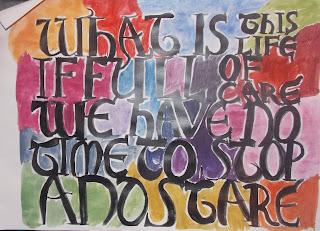
"What is this life I full of care we have no time to stop and stare."