Monday 10 March 2014

Research week 1

After visiting the exhibitions I decided I wanted to learn more about Blood and what it does. The last time I learnt about it must have been 3 or 4 years ago. So to achieve this I went to the study zone and pulled out loads of books that I wanted to look at. The first load were medical books. What attracted me to the books were the beautiful illustrations as photographs. All of this imagery has been documented in my sketchbook which allows me to constantly look over the large quantity of images and see the different ideas I could get. I did a lot of research into the arteries and the different components blood is made of so I could fully understand how blood works and why blood is so vital to human being.

Whilst I was at the study zone I also picked up two books that were completely nothing to do with my topic but caught my attention. The first book was about medieval Armour, there was a specific Armour that caught my attention seen below. I could carry on a new idea with creating lots of different patterns onto the human body representing the blood vessels. As well as this I could continue to look at colour to get the same richness of the drawing below.


The second book I looked at was M.C Escher whose carefully drawn pattern work really remind me of the anatomical diagrams I had read at the beginning.There was also certain pages that kept me thinking about motion something I think will be a huge element of my project which you will see below. I love the obsession of geometric shapes and the way that M.C Esher was able to manipulate them in order to create not only a pattern but also a story. I particularly like the image below as it shows a transitional journey starting from lines until it reaches because birds, this is something I could seeing turning into a motion graphic. This is really relevant to me as I hope to make a motion graphic for my final piece. As well as this I really like the pattern design something which I mentioned previously on the Armour photograph- I could carry on designing pattern to represent blood in some way.


Learning more and more about way the blood works makes me more relaxed when it came to making an appointment to donate blood myself. I wanted to give blood as personally I feel it is hypocritical to ask young people to donate when I have never donated? After researching more into the NHS and the process I was able to test out the ins and outs of making an appointment. It worked amazingly and I have made an appointment for next week to donate. I even got letters thanking me for making an appointment and a questionnaire asking about my medical/sexual information which I was asked to bring on donation. The letters arrived in a personalized envelope which says on the front "Do something amazing, Donate blood". This instantly made me feel really good for donating. This goes to show how even one bit of positive can make me feel like I have already achieved something incredible. I want to make all the young people who will see my campaign feel this way too.


After this I tried to look into current campaigns that caught my attention as well as current NHS campaigns for giving blood. This is important in my eyes not just to get ideas but to see the angle they were trying to convey and the different ways to take the ideas. There was one campaign that I really think works well that uses David Bowie's lyrics to play on " You can be heroes, for more than one day". Using such a pop icon as David Bowie really captures people attention- I think it also distracts from the clinical feel that the NHS somehow gives off. Another really interesting poster I really loved uses humour and playing on the vampire idea stating "Don't travel to Transylvania, don't waste your blood".


All images above was Author's own 2014


Steven Spielberg Schindler's list 1993
http://www.cinemarx.ro/stiri-cinema/video-patinaj-artistic-inspirat-din-lista-lui-schindler-premiat-cu-aur-la-jocurile-olimpice-de-la-soci/ Accessed on 10/03/2014
 During this research stage I watched Schindler's List independently however the relevance to what I was looking seemed obvious. Although the story line of this epic movie directed by Spielberg had nothing to do with giving blood it discusses blood shed as well as the poignant red used. One of the reasons perhaps people are nervous when giving blood is the deep rooted relation to blood and death, in this film there is near enough non-stop blood shed and therefore you almost get used to the unjust actions. This could be effective perhaps if I try to promote blood getting teenagers used to the sight of giving blood. 

Another element of Schindler's list which really stood out to me when I watched it the first time was the colour red is applied. The red looks so out of place yet demands our attention making us not only connect with the character who only appears for less than two minutes out of the lengthy film, but become curious. I think the limited use of red has made the film so much more dramatic and memorable-This could be something to strongly consider and go against the obvious colour of red and only use it slightly to add a greater emphasis.
zareenamedia.wordpress.com Accessed  on 10/03/2014
thehitchcockproject.wordpress.com 
Accessed on 10/03/2014
Marnie- Alfred Hitchcock 1964
film.thedigitalfix.com 
Accessed on 10/03/2014
www.mademoiselleamontreal.com 
Accessed on 10/03/2014
Marnie is one of my favourite Hitchcock films, specifically because of the way it was filmed. The concept is quite powerful addressing anxiety and morals. The character Marnie, played by Tippi Hedren shows a story about a woman who steals from her employee to give money to her sick mother. Yet whenever she sees the colour 'Red' she bursts into panic attack. Again this story has little to giving blood however I think it is really important to take concepts and ideas from films that pull me in and make me think.

This film was beautifully filmed something that I really need to consider if I create a motion graphics. Every time Marnie sees the colour red the whole screen gets tinted (seen above with Marnie screaming). This notion makes even the viewers get anxious with the colour red. My favourite scene is when Marnie accidentally drops red ink onto her blouse, as viewers the see very clearly of Marnie's fear and identity for the first time her anxiety.

 Red signifies many things, murder, violence, love, passion etc. However in this story it represents blood. What I wanted to really establish was the fact that a lot of people I know and in general are scared of the sight of blood too, could this be perhaps because red is the colour the eye reacts to first. Identifying this perhaps could help me plan colour schemes, do i want to include red? Or do I want to apply on the smallest about like the drop of Red ink on Marnie's sleeve.


I think I will defiantly add red because there is no point in telling lies to the people blood is red and it is something you will see when you give blood, I want people to realize not to associate blood with something bad but something good.

Hancock's The Blood Donor 1961
tonycavanagh.com
Accessed on 10/03/2014
Hancock's The Blood Donor was the first short episode that has addressed donating blood as a funny thing. The take on the situation creates an humorous awkwardness that is relevant in everyone. I think the show really lightened up giving blood for me and I felt less worried about it from watching it. Released in 1961 the Blood donor episode allow us to see the process and campaigns for it subtly. I think the subject itself can be taken the mick of because it makes the process funny. And when people laugh the tension is gone. After watching this I think i have thought much more about how I could perhaps add an element of humour in my campaign to get the younger generation in giving blood. After all I strongly believe that people aged 17-25 relate to humour very much and it breaks the ice on serious subjects. If we look at comic relief for instance although there are serious emblems within the show there are comedy sketches which lighten the mood. Humour can leave just as much as a mark as say sad emotion. This is something to further consider when working on my project.

Autopsy Life and Death- Prof. Von Hagens Episode 1 Blood


article.wn.com
Accessed on 10/03/2014


To the left you can see an image taken from the Autopsy Life and Death- Prof. Von Hagens. The first episode was about the blood and circulation system. I have heard about Professor Von Hagens before; I know that him as an artist which I now know isn't right. However someways you could say he is. His work explores the human body and anatomy in particular.

Author's own 2014
Watching this program I thought I would be able to easily follow however it was rather complicated at times. However as I researched into blood before watching this program I able to follow. If I had not researched into blood I think it  could get quite complex. The whole atmosphere of the program was very science based; I think that it has helped me in my current project because it has shown to me that going into this project as scientifically driven could perhaps could confuse a lot of people. Therefore I need to make it so that the information I am writing about is easy enough for the target audience I am aiming can understand it. The only thing which I think worked really well was the brutal honesty of the program. It really showed me how the body is a body and it is functions like clockwork, we are a piece of natural engineering and everything needs to function in order to make our bodies to work.


Research Week 1 Exhibition Research

Author's own 2014
Science Museum,
Welcome Collection and Medical History exhibition.
At the beginning of my research stage I have decided to look into medical history. I went to see The Science and Art of Medicine as well as the Welcome collection at the Science Museum. When I first walked into the empty large exhibition room my first thoughts was actually rather scared. I didn't like the clinical feel and the scary instruments all left out for me to view. In this sense it would scare me to give blood. Especially if I had to view all of that equipment first. The whole atmosphere of the room was not right. If I was able to control the look of this exhibition my first thing I would change is light. If you look in the images it looks eerie and gloomy. Where is the excitement and passion in the revolutionary history of medicine.
Author's own 2014
Author's own 2014


Author's own 2014
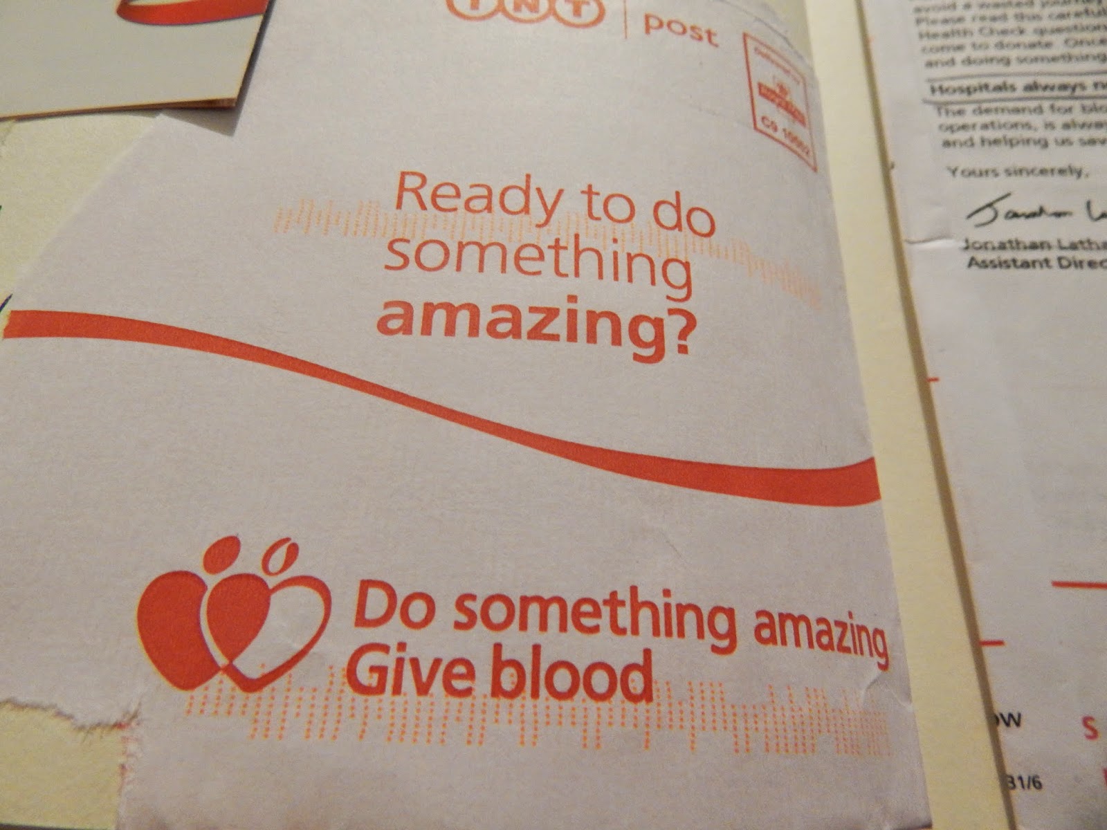
Looking around this area I came across a special area dedicated to the history of giving blood in the 19th Century. Obviously this relates a lot to my project and I was able to photograph and read up what the exhibition was showing. The poster to the left you can see is campaigning for people to give blood. The poster in itself is really simple. The layout uses the space to emphasize the little information. However the vocabulary and phrase used is really powerful and in my eyes would make many people consider to give blood. There is no motto at the end of the poster declaring it points to the NHS or Donating blood other than the bottle of blood. Although this is a good idea I want the idea of giving blood to be emphasized and therefore will ensure that it is mentioned.
Author's own 2014
The other sections of around the poster shows the different equipment used for blood transfusions such as the needles and the blood bags which you can see to the left. In one section of the exhibition it explains how vastly the numbers have increased since the 1940's as well as this it spoke of technology advances. I also learnt at this exhibition about Karl Landsteiner. Landsteiner created the format that determined the blood groups from determining the antigen ( the protein) on the surface of red blood cells. After viewing the exhibition I realised the amount of information that I didn't really know about or fully understand. Because of this I really want to research more into the circulation system and the way our blood benefits us and how blood is used. From going to this exhibition I am able to really appreciate how far blood transfusion has come, as an example to the left you can see that the blood bags were not disposable but washable! Looking at how much we have progressed allows me to appreciate how far we have come. One thing which I really liked on the showcase was a set of pins given out to donors after they have given blood. Used as a sort of persuasion to get more people on board. I think this was a really good idea. As mentioned in the text next to badges, In many other countries blood is paid for such as in the US. In Britain it is up to charitable donations, an incentive which is why these badges could be useful. However I think that although then it was a good idea now I want to campaign for people to give blood because they can not just so they can get a badge. It is up to goodness in people's own hearts.

Author's own 2014
Author's own 2014
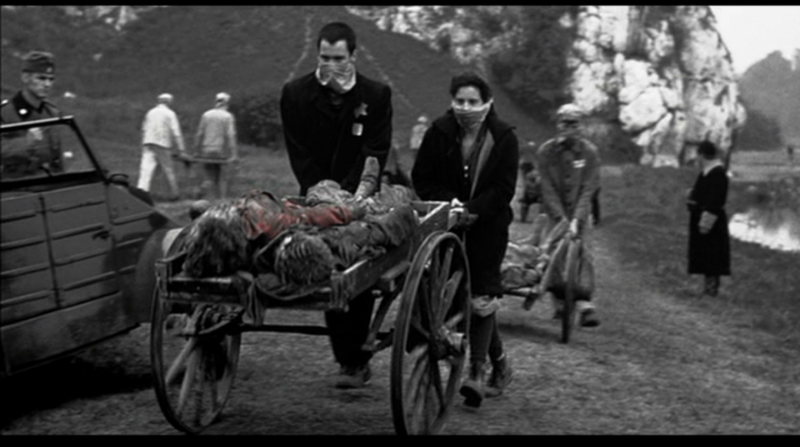
In the US you are paid for Plasma Donations. equating on average around $20-$40 for your first time etc. The Plasma donation allows donors to donate more frequently as it only takes part of the blood (plasma cells).  Around the initial blood donation section there was also a section about blood cells. They were presented on massive light boxes illuminating the different colors that blood  can have. I think this was a really good basis to consider looking into. Blood is more than red liquid it is made up of different things. Which is what  I really need to research more to fully understand how blood actually works. The image below of the 14/15th century illustration isn't showing the act
of blood transfusion however I thought it was showing that. It allows me to see the power of interpretation and how something can look different once you look closer. This has already started to take place for me learning more about giving blood. 
As well as this the picture is very sinister looking and does create feelings of anxiety.

 After looking at this exhibition I looked at the Welcome Collection also available in the Science Museum. The welcome collection again had another

Author's own 2014
weird aura about it. Again completely empty there was an array of dummies suggesting certain medical
break through and war medicine etc. I did not think that this was as relevant as the first exhibition. However what it did tell me was again the atmosphere I do not want to have, the clinical- no emotion feeling. I want to be passionate and exciting, because it is exciting knowing that you can save someones life for nothing. It is something which science and medicine should be proud of- so I want to take all this information and history out of the dark room and put it into light, and somewhere it will be recognized. Be it on the internet or on TV so people my age will be able to view it easily. I want to plant the seed. 

Hunterian Museum
the-history-girls.blogspot.com
Accessed on 10/03/2014

I have never heard of the Hunterian museum before this project so I was really excited to visit the museum. The Hunterian is located within the royal college of surgeons, presents a much different atmosphere. Walking in to the building I felt more professional, asking the receptionist where the Hunterian museum you greeted me happily and gave me a visitor badge to wear. After walking through the barriers and going up a staircase filled with many oil paintings I arrived at the museum. There was so many more people in this one exhibition than there had been in the Medical collection at the Science Museum. The lighting of the room was so much better and seriously lifted the atmosphere. 

Unfortunately you are not allowed to take any photographs, however this did mean I was able to take in the museum itself a lot more. There was so many different medical marvels. I have never seen so many different human parts and skulls before in my life, at first it did shock me however after the initial reaction I was able to really appreciate the medicine behind it. It dawned on my how these diseased skulls and broken parts were used for education for the surgeons in the college. Because of this aspect the room is so much more powerful and more interesting, this is something I need to consider do I want to just show something or do I want to explain? As previously mention I need to go further than looking at what happens to the donors when they give blood but also at what the blood is used for after and why it is needed. 

There was not to much that talked about blood but it did speak of its need during surgery. As well as this in the far corner there was what looked like a weird mesh of red wires. When I looked closer I identified it as a stillborn babies arteries. The baby had passed away and the arteries where then plasticised leaving this delicate piece. This was really sad because of the fact it was so small and just a baby, but looking at the medical structure it was really visually interesting, it was the first time I was really able to appreciate all the veins and arteries that allow a body to survive. *I hope to look more into arteries and how perhaps I could use in a design. On the top floor there was a whole section on plastic surgery at queen Mary's- the hospital I was born in Kent. Although this did not have anything to do with Donating blood it was really interesting to learn about something from my own history. 

Overall the visits to the different exhibitions was really helpful for my own project as I was able to appreciate the history of medicine and the way it has shaped Britain's history as well as internationally. I have also been able to consider the atmosphere of what I am presenting, do I want something clinical and statistically informed or do I want something that can actually connect with people on an emotional level ( I propose the latter). The trips has allowed me to see different ways donating blood was campaigned and some information on the history of blood transfusion. From these visits I hope to research more into specific areas and ultimately have a much better understanding on giving blood and blood itself. 

Friday 7 March 2014

Final Major Project Proposed Idea via board.

Author's own 2014
Above you can see the board in which I presented to my crit. The board proposes my final chosen Idea for my FMP. I have chosen to campaign for donating blood. I hope to aim to people of younger generation because of the lack of donors from this age group. It is vital more donors to come forward so that the future is guaranteed for blood donations. It is something close to me as my mum has given blood for as long as I can remember and I have come of age to give blood.

 I hope to look into the Science museum and find out more about the medicine behind it. Furthermore looking a great deal into the NHS and the information provided so that when I campaign I have the right information to inform. I wanted to look into the First thing first manifesto as this is a manifesto I am strongly compelled to. Although I have yet to establish myself in the design industry I hope then when I am an active member that I consider doing design work for good causes and not just to package beans. I'm hoping this campaign will bring good. I do not want a clinical feeling so I put down some colorful designers like Morag studios who uses bright bold typography and iconography in there work. I want my work to be relatable to colourful and life in general not just statistics on a piece of paper I want it to reach people.