This is week three of the FMP; according to my time schedule this is the first week in which I should be now developing ideas from my research. Today I have decided to to really look over my project so far and the research I have done because I have looked at a lot. I want to really think about what I want to do and how I can translate any ideas I have. This morning Clementine a practicing Graphic Designer told us a bit about her work and two projects she has worked on. The thing that really stood out to me was a set of questions she asks her self or in a team when doing work. I decided to answer these to see what my answers would be.
What are we doing?
Creating a campaign for 17-25 year old's to donate blood
What is the product?
Campaign- motion graphic/ moving image piece maybe posters or illustrations within development
Whats the offer?
Saving someone's life
Concept?
To inspire the youth to donate, do something good, save lives.
Audience?
17-25 year olds
Format?
Motion graphic or print based piece.
Essentials?
Must relate to donating blood clearly.
Deliverables?
Must suggest donating blood helps nature, perhaps a scientific relation.
 |
| [www.houseoffraser.co.uk] Accessed on 20/04/2014 |
I want too keep reflecting over these points as well as my sketchbook to really stay on track and read the things which I have pointed out to read. This talk was really helpful and gave me more enthusiasm to pursue my FMP. Clementine showed us two different types of work she has previously done. The first with Virgin Atlantic and a smaller handbag company called the village English. Both were different in pursuit. On the virgin Atlantic project she was given around 9 months and worked within a bigger group. I really loved the quick sketches she carried out, although they were quick they were clear and neat something I need to do when I develop ideas this week.
The Village English project was really beautiful and really inspired me. To the right you can see the logo developed by Clementine. I especially liked the way her process of collecting imagery and carrying out many different types of mark making. Overall her talk defiantly made me think more about development work for my project as well as how I can create work from developing methods such as mark making. Think of the unexpected.
Paul Smith Exhibition and Design awards at the Design Museum
This week I also was able to visit the Paul smith Exhibition at the Design Museum as well as the Design awards. Paul Smith work known mostly for his work in fashion was actually really inspiring. I really loved the way the whole exhibition was laid out it was really personal. Perhaps creating a sort of transitional journey like the exhibitions layout. As you walk into the exhibition you are able to see the size of Smith's shop. This was really shocking to see to begin with because it was literally only 3m big. But it goes to show from what Smith started with to how he transcended into a major icon in the fashion world. Past the mini shop you can see Smith's huge collection which you can see in the pictures I took below. There was so many pieces of artwork which made it hard for me to focus on one at once. However there were some that stood out more than others which you can see below again.
As well as these artwork there was different sections of the exhibition that showed Paul's fashion work; the colours were really vibrant something which I like in studio Morag and Iannone's work. These colour inspiration should influence this weeks process. There was a section in the exhibition that showed all of Paul Smith's shops, each one completely different I really believe this is such a wonderful idea as it shows the complete dedication to each of his stores. In this section of the exhibition there was also a huge wall of buttons which was amazing to interact with, reminded me a lot of our puzzle box and the physical interaction- and the yearning to touch it. The last bit which I really loved about the Paul Smith's exhibition was seeing how Smith works and his environment. Seeing his wives sketches for example is something I always like to appreciate the development sketches. Furthermore it allows me to think about my sketches and how I can improve it so it looks clearer as an idea. (Below are photographs from the exhibition.)


 All photographs above are Author's Own 2014 |
| This picture, bottom and the one at the top right are all from the collection Paul Smith owns. I think the whole layout and colour tones are beautifully designed out. I really wished he had written the names of the artist however it strengthen the feeling on personal ownership. To the left image above you can see the button wall covering everything showing you how much you really do wanna touch it. Paul Smith wife's sketches are the centre picture. |
 |
| Author's Own 2014 |
 |
| My camera was playing up making the colours become even more vivid and exotic. I think I want to play around with this colour palette this week. Author's Own 2014 |
 |
| Beautiful colours Author's Own (Two image below are also Author's Own 2014) |


 |
Design awards at
the Design Museum.
 |
 |
Accessed on 20/04/2014 |
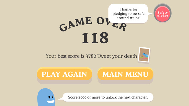
campaigning for train safety. I love the idea behind this campaign and the way they made out the dumbest way to die would be getting killed by a train. The whole campaign made over $60,000,000 and reduces train accident related deaths by 21%. Not only this the song charted in 28 countries and had been covered hundreds of times on YouTube.
The whole campaign was a definite success and has reached people(specifically young people). Another amazing aspect to the campaign is the way viewers/ players are reminded to pledge to be safe around trains allowing all of the campaign to have relevance. Furthermore it allows the makers to see how many people have listened to the message.
The best way to see how I can make my project just as success- is to analyse why. I think it was so successful because of the interaction, the game app for instance mostly used by young people, the humour of death again aimed at young people. The colourful animation aims at the young people once more, I really like the use of animation as it lightens the mood up on a sad subject, the humour is like Hancock's blood donor after watching it you feel more positive in a weird way. I think humour is defiantly something I should consider as well as aiming my campaign to social networking sights like YouTube, Facebook or even trying to create an app.
(Below are some other photographs I took at the design
awards in the design museum that I liked the look of)
 |
| I think that the above pattern although discreet is really nice, it reminds me of M.C. Esher. Author's Own 2014 |
 |
| Above see illustrations drawn onto newsprint, I think this translates really nicely and flows almost in a poetic way. It feels like we should connect a story to the actual newsprint with the illustrations. Author's Own 2014 |
 |
| The above is an illustration onto an envelope. As well as reminding me of Morag due to the vibrant colour the envelope reminds me strongly of the NHS envelope I got thanking me for applying to donate blood. On the front of the envelope was the words that said "Do something amazing, give blood." Author's Own 2014 |
No comments:
Post a Comment