Sunday, 20 April 2014

Week 3 Development week

Talk with Clementine
This is week three of the FMP; according to my time schedule this is the first week in which I should be now developing ideas from my research. Today I have decided to to really look over my project so far and the research I have done because I have looked at a lot. I want to really think about what I want to do and how I can translate any ideas I have. This morning Clementine a practicing Graphic Designer told us a bit about her work and two projects she has worked on.  The thing that really stood out to me was a set of questions she asks her self or in a team when doing work. I decided to answer these to see what my answers would be.

What are we doing?
Creating a campaign for 17-25 year old's to donate blood
What is the product?
Campaign- motion graphic/ moving image piece maybe posters or illustrations within development
Whats the offer?
Saving someone's life
Concept?
To inspire the youth to donate, do something good, save lives.
Audience?
17-25 year olds
Format?
Motion graphic or print based piece.
Essentials?
Must relate to donating blood clearly.
Deliverables?
Must suggest donating blood helps nature, perhaps a scientific relation.
  [www.houseoffraser.co.uk]
Accessed on 20/04/2014


I want too keep reflecting over these points as well as my sketchbook to really stay on track and read the things which I have pointed out to read. This talk was really helpful and gave me more enthusiasm to pursue my FMP. Clementine showed us two different types of work she has previously done. The first with Virgin Atlantic and  a smaller handbag company called the village English. Both were different in pursuit. On the virgin Atlantic project she was given around 9 months and worked within a bigger group. I really loved the quick sketches she carried out, although they were quick they were clear and neat something I need to do when I develop ideas this week.

The Village English project was really beautiful and really inspired me. To the right you can see the logo developed by ClementineI especially liked the way her process of collecting imagery and carrying out many different types of mark making. Overall her talk defiantly made me think more about development work for my project as well as how I can create work from developing methods such as mark making. Think of the unexpected.

Paul Smith Exhibition and Design awards at the Design Museum 
This week I also was able to visit the Paul smith Exhibition at the Design Museum as well as the Design awards. Paul Smith work known mostly for his work in fashion was actually really inspiring. I really loved the way the whole exhibition was laid out it was really personal. Perhaps creating a sort of transitional journey like the exhibitions layout. As you walk into the exhibition you are able to see the size of Smith's shop. This was really shocking to see to begin with because it was literally only 3m big. But it goes to show from what Smith started with to how he transcended into a major icon in the fashion world. Past the mini shop you can see Smith's huge collection which you can see in the pictures I took below. There was so many pieces of artwork which made it hard for me to focus on one at once. However there were some that stood out more than others which you can see below again.

As well as these artwork there was different sections of the exhibition that showed Paul's fashion work; the colours were really vibrant something which I like in studio Morag and Iannone's work. These colour inspiration should influence this weeks process. There was a section in the exhibition that showed all of Paul Smith's shops, each one completely different I really believe this is such a wonderful idea as it shows the complete dedication to each of his stores. In this section of the exhibition there was also a huge wall of buttons which was amazing to interact with, reminded me a lot of our puzzle box and the physical interaction- and the yearning to touch it. The last bit which I really loved about the Paul Smith's exhibition was seeing how Smith works and his environment. Seeing his wives sketches for example is something I always like to appreciate the development sketches. Furthermore it allows me to think about my sketches and how I can improve it so it looks clearer as an idea. (Below are photographs from the exhibition.)


All photographs above are Author's Own 2014
This picture, bottom and the one at the top right are all from the collection Paul Smith owns. I think the whole layout and colour tones are beautifully designed out. I really wished he had written the names of the artist however it strengthen the feeling on personal ownership. To the left image above you can see the button wall covering everything showing you how much you really do wanna touch it. Paul Smith wife's sketches are the centre picture.
Author's Own 2014
My camera was playing up making the colours become even more vivid and exotic.
 I think I want to play around with this colour palette this week.
Author's Own 2014
Beautiful colours
Author's Own (Two image below are also Author's Own 2014)


theinspirationroom.com Accessed on 20/04/2014


Design awards at 
the Design Museum.

www.adweek.com Accessed on 20/04/2014
thisisnotadvertising.wordpress.com
Accessed on 20/04/2014

During my visit to the design museum I viewed  the design awards and in one section of this exhibition was 'Dumb ways to die'. Dumb ways to die is something I have seen before when my sister got the game and then showed me the song which goes with it, however I did not realise it was
campaigning for train safety. I love the idea behind this campaign and the way they made out the dumbest way to die would be getting killed by a train. The whole campaign made over $60,000,000 and reduces train accident related deaths by 21%. Not only this the song charted in 28 countries and had been covered hundreds of times on YouTube.

The whole campaign was a definite success and has reached people(specifically young people). Another amazing aspect to the campaign is the way viewers/ players are reminded to pledge to be safe around trains allowing all of the campaign to have relevance. Furthermore it allows the makers to see how many people have listened to the message.

The best way to see how I can make my project just as success- is to analyse why. I think it was so successful because of the interaction, the game app for instance mostly used by young people, the humour of death again aimed at young people. The colourful animation aims at the young people once more, I really like the use of animation as it lightens the mood up on a sad subject, the humour is like Hancock's blood donor after watching it you feel more positive in a weird way. I think humour is defiantly something I should consider as well as aiming my campaign to social networking sights like YouTube, Facebook or even trying to create an app.
(Below are some other photographs I took at the design 
awards in the design museum that I liked the look of) 

I think that the above pattern although discreet is really nice, it reminds me of M.C. Esher.
Author's Own 2014
Above see illustrations drawn onto newsprint, I think this translates really nicely and flows almost in a poetic way. It feels like we should connect a story to the actual newsprint with the illustrations.
Author's Own 2014
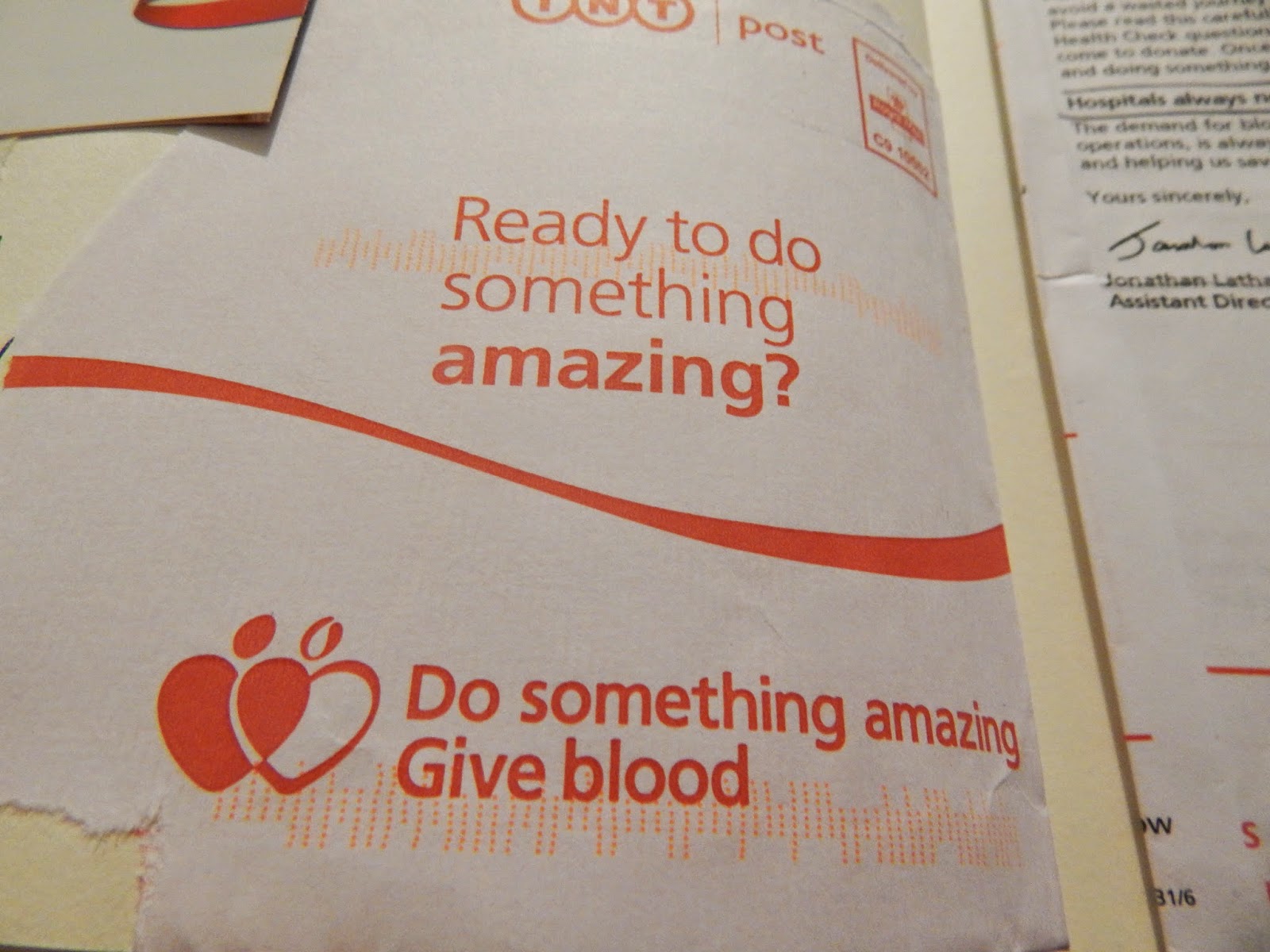
The above is an illustration onto an envelope. As well as reminding me of Morag due to the vibrant colour the envelope reminds me strongly of the NHS envelope I got thanking me for applying to donate blood. On the front of the envelope was the words that said  "Do something amazing, give blood."
Author's Own 2014

Monday, 14 April 2014

Week 2 Research

Image of my survey I handed out
Author's Own 2014
Survey Feedback
In order to understand my target audience I have created a survey given out to people aged within my target audience. I did not do a multiple choice because I feel it is better to let participants write as much as they want. And ultimately the more diverse questions the more possible ideas I get and information back. I asked nine question which were:

1. Age?
2. Have you donated blood?
3. Would you ever give blood?
4. Why haven't you given blood?
5. When and where was the last time you saw anything about donating blood? (i.e. TV, Internet, article, etc.)
6. Do you know what happens when you give blood? (The process)
7. What would make you give blood?
8. Do you think the NHS campaign to give blood should be updated?
9. How do you think the NHS campaign could change to appeal to you?

After getting the  surveys back I got a lot  of information and as I wanted all the surveys provided me with different outcomes which I could think about. (I am going to summarize all the surveys feedback.) Question two basically confirmed my initial prediction that the younger generation have not donated blood. only one participant had which goes to show all recipients were within age range of being allowed to give blood yet no one had. Question 3 was asked to see if participants were just completely against the idea of giving blood or if they would give blood.  Near enough everyone (accept the few who was scared of needles or sight of blood)  said they would give blood. This is a really positive response because it gives me so much potential to inspire people to donate especially as they said they would one day donate.

 The fourth question basically is to really understand what has stopped people from given blood or why haven't they done it. The majority of the people I ask were adamant they had never thought about it and they don't know how to do it. Reflecting on this it is clear the information NHS is providing isn't reaching people and potential first time donators. This leads on to question number 5 which asks participants when was the last time they saw anything to do with giving blood. This question span from  my idea that I never see anything about  giving blood, the reason I decided on doing this project and that giving blood  was prevalent in my mind is because my mum gives blood regularly. However I personally believe campaigns by the NHS are not reaching the younger generation. My prediction was again right because near enough everyone stated the same fact that they could not remember the last time they saw something or that they saw it on my Facebook that I was giving blood. Just this could  equate to a lack of young people donating blood and is something I really need to consider when designing an effective campaign.

Question 6 was asked to see if participants of my survey knew about the process of giving blood. The lack of knowledge of the process was obvious with many missing out steps or just admitting they did not know anything. Another contributing fact to why young people may not give blood-because of the lack of information. "The fear of the unknown". The next question was to understand how I could motivate young people, there was a lot  of varied answers but my favourite and the most common answer was saving people's lives and knowing more information. I think this is a really beautiful result because it goes against the stereotype of young people and shows that they care just as much as everyone else and want to make a different. Emphasizing the fact people save lives  is already present but perhaps doing it at a different angle could be interesting.

Question eight was adamant everyone agreed with the fact the NHS campaign should be updated; which in my eyes is weird as there is already a current campaign running. This  goes to show two things. 1. That the campaigns are reaching young people. 2. The campaigns are not appealing to the younger generation. It is up to me to really attract the young people of Britain to donate. The last question asks the recipients personally how could the campaign attract them.  There was again a range of different answers some asks for the campaign to be fun, more visually exciting, emphasize your saving lives and producing more information. I think all of these suggestions are really helpful and will help me when designing ideas next week.

Overall the survey will allow me to bare in mind what my target audience feel about current and future campaigns. This is vital for me to make a campaign which will attract young people. The whole experience of giving out surveys has been a success and people after even told me that I have inspired them and that they want to give blood now. This is such a positive thing because people have been influenced just by a survey. This is because the idea never occurred to them which is what my survey allowed them to do was question why haven't they something important. 

Pay it forward- 2000


www.dieselsc.com
Accessed on 11/04/2014
Pay it Forward is one of those films I personally think should be shown to everyone. The story is incredible and has real meaning to it. As a brief summary of the story is about a family unit and specifically the son's actions for a school assignment. The assignment as
ks students to change the world. It is how the eleven year old Trevor comes up with a solution that moves the story forward. He comes up with the idea of Pay it Forward. In which he helps three people, but help them in a big way- something they cannot do on there own. Once he has helped them he does not ask for anything back he only asks them to pay it forward to three more people. The whole circumstances are really beautiful and really makes you think. After this film all I wanted to do was Pay it forward. There are so many beautiful quotes used in the films that are beautifully written. One which really stood out to me is when Trevor says:

"I think some people are too scared, or something. I guess it's hard for people who are so used to things the way they are- even if they're bad- To change. Cause they kind of give up, and when they do, everybody kind of loses. "

I really love this quote, it is summarized so perfectly. In fact  I think that everyone can relate to this quote. Change is something everyone is scared of be it a new school, trying new food or even donating blood. We fear the unknown because we are vulnerable, we are not prepared- unlike our structured routine life our stability is taken away from us. I think the main thing to reflect on is the fact that change is scary and in order to make people want to change is to show them something which shows them what they fear is not scary.

Pay it forward shows me more than anything the good in people, and the yearning for good in the world. This film has really helped me think about my project and applying the concept of changing people's lives and how this effects me emotionally. After the film ended I was crying; even though this film is fictional I was emotionally connected with this story and it therefore helped me change perspectives. There are people in hospital now, little children suffering from blood diseases and spending there days listening to life of  machines where here I am in the comfort on Uni writing about it. If you could save people's lives like this would you? Only 4 in 100 people donate blood who can. I feel like people do not even realize how needed it is- they just expect it on tap. People need to know.


(Image above Author's Own 2014)
After arranging everything I was finally able to give blood for the first time. Above are two images the one to the left is the back of my head donating blood and the one next to it depicts me with my bandage. Sadly when I asked the nurse if I was able to film myself donating blood she said I was not allowed due to the needle or some other reason. This would just mean I would need to really remember the process to document here. When I first arrived I was entered into the computer and then was asked to  take a pint of water and consume it. The nurse who I spoke to on arrival was really nice and made me feel very welcome allowing me to feel more comfortable.

ericajean06.tumblr.com
Accessed on 14/04/2014
Considering my FMP is campaigning for young people to donate blood It was really interesting to see how many young people were waiting to donate blood. And as I predicted there was a lack of young donators in the community centre where I was about to donate blood. There was around 3 other young people aged at 21-23. All together waiting to give blood there was around 30-40 people; other than the three the ages ranged from 40-60. After I drank my water I waited for my name to be called out. After ten or so minutes I heard "Miss Victoria Geary", I followed the very tall nurse, Bill into a private area. The nurse was very extremely friendly, he looked over my questionnaire I was asked to bring with me (the questionnaire basically asked me about my medical history etc). After this he told me he was going to prick my finger and see if my iron levels were alright. Using a weird mechanism he pricked my middle finger and took the blood to test. I was told my iron levels were perfect and he finally said to wait near the wall to get my blood taken.

My mum was called, my sister was called and then finally I was called up to give blood. I took my ipod with me so I could listen to some music. I was asked what arm I wanted drawn - I said left- and relaxed as the nurse got everything ready after preparing the arm with alcohol wipes she eventually pushed the needle in. I though this would hurt however it was uncomfortable for a millisecond and then there was no pain at all! After 6:19secs the 475ml (just under a pint was drawn) and I was able to go get some refreshments.

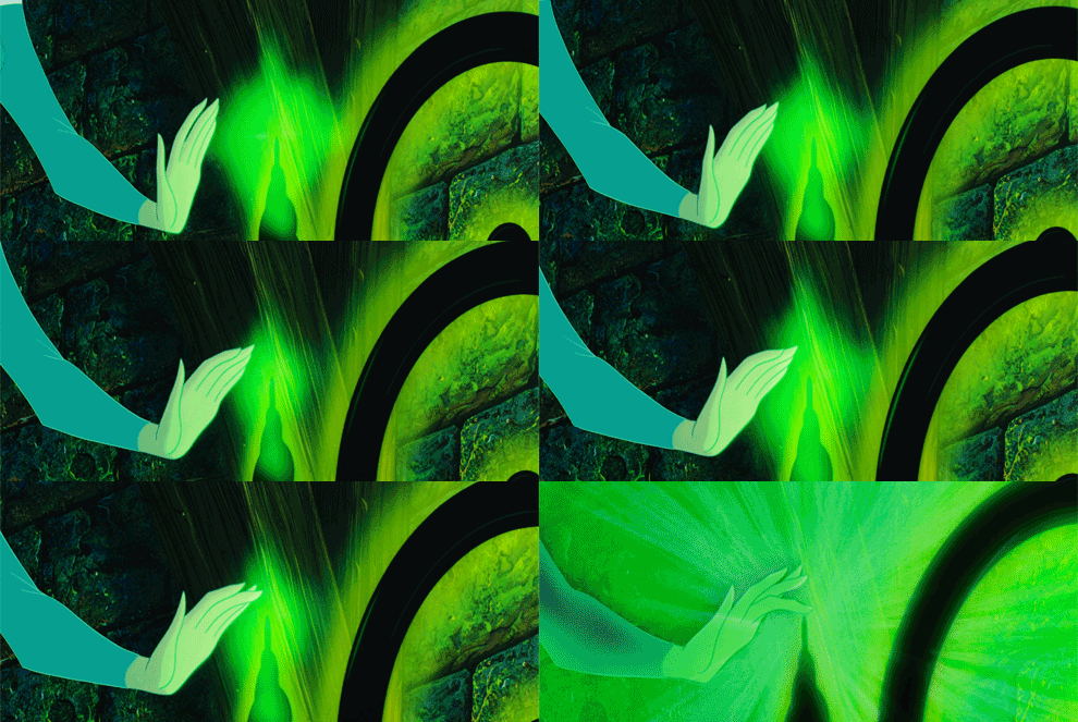
Above you can see a GIF of Sleeping Beauty pricking her finger on the spindle, I think this is a really fun way to show my process. But also it shows fear and how it is represented- something I need to avoid in my motion graphics. The dark and dingy colour palette is something which emphasizes pain and anxiety.

After the donation I don't know why I was even worried? I don't want to be cliche but the process was quick, friendly and not painful. In conclusion now that I have donated I am even more enthusiastic to campaign for young people to donate! Furthermore I will 100% donate again.

www.dezeen.com
Accessed on 14/04/2014

Morag Myerscough
Morag_myerscough_no_guts_no_glory
www.itsnicethat.com
Accessed on 14/04/2014


Morag Myerscough is someone who have I looked at many times before  during this foundation year and I am really in love with the studio. All the work is mostly typography based however more than the typography I love the vibrant colours that just make there work fresh and so exciting. These intense colours really remind me of the anatomical figure in my sketchbook- perhaps this could be something I pursue in the development stages of my work.

 What I love more than just the type is the way the work is applied to not just paper but on furniture, huge signs, walls etc. This reminds me of an artists I saw in Berlin called Dorothy Iannone who also applies her incredibly detailed work onto furniture as well. I think that Myerscough will influence my work as I feel the vibrant bold colours is something I feel will be amazing to apply to my work. It keeps the work more appealing to younger people and stays away from a clinical feeling campaign.

During the second week of research I was lucky enough to visit Berlin, a place where contemporary design is famed for. It was interesting and the whole atmosphere Berlin was completely different the UK and London in particular. It was weird sitting on the train and see abundant of gravity covering all walls and giant paintings of side of buildings. These factors were actually really rewarding for my eyes and gave me a  new outlook on gravity something I don't necessarily always agree with. We visited three exhibitions the Museum of modern art, Photography museum and the holocaust museum. All three were actually really different from each other. The first we visited was the museum of modern art. Below are some photographs I took whilst at the Museum.

[All Images below unless stated is Author's own 2014)


Dorothy Iannone was one of my favourite sections of the museums (all her work seen above.) Her work was so illustrative and colourful that the playfulness of it really spoke to me! I think perhaps it was the honesty of her subjects and showing the truth about sex in some ways. I think this is something to pick up on because in my campaign I want it to be as honest as possible so that people are not lied to. I think that there are many things which I am going to pick up on-the first being the vibrancy and the second the way Iannone projects are work onto furniture or large walls alot like Morag studios. 

I really like the above and below images that play with colour and turn it into something visually interesting. I think I  like the closeness of the lines above as it gives of some weird illusion. 


These design show various imagery but what caught my attention was the play with red and the tones, although I don't want to use red within my work I think its refreshing to see how red can work really nicely onto some designs. Applying solely red to any design reminds me of blood which is probably why I decided to photograph the above images. 

This piece caught my attention because it visually is a really appealing piece- by this I mean i really just wanted to touch it and feel it. This piece was created by numerous wooden podiums that created a really nice textured piece. It also reminded me of blood cells in a disk- an image I photographed at the science museum. (To the right shows a similar image). Seeing these two images together really shows how I could translate the blood cells onto the top image. The image below was taken from:
                                                www.shutterstock.com Accessed on 14/04/2014


Above is only a small section of a huge wall of artwork. The piece really caught my attention because of the size as well as the amount of work on the wall. The artist gathered pieces of dust or dirt and separated the work so it was put in catergories. The work strongly represented some sort of scientific test. This reminded me of some of the work I wanted to perhaps look into ad felt it would be important to photograph. Perhaps the only thing which I think it could lack is colour? But the way the artist chose different varieties of brown is effective is a subtle way. 

Above you can see some of the notes I took at the museum which really shows my intial ideas and thoughts from the different exhibitions I visited. 


The Holocaust museum was very sad and really showed the pinacle of humanity. I think this was something to really discuss on my blog. The holocaust shows humanity at its worst and it faces you with the question would you have helped the people if you could? I think questioning something like this you begin to emphasis for the victims and consider your own humanity. I think donating blood is similar it defines the people who want to save others lives and humanity I guess. - Not that not donating blood is comparing people as Nazis but just the consideration of others who are on the verge of death and in need. Another thing about this muswum was the notes written to the families from the victims which really made me tear up. It was so sad and you begin to really connect with the victims, you want to help.  

  
Accessed on 14/04/2014
Above is a photograph I viewed whilst I was at the photography museum and it really made me think about the two arms connected. This is something I would like to perhaps develop in the development stages the link between the donor and recipient.. I do love the idea of dance and somehow showing the donation of blood through dance in some sort of cinematic way. The image is very strong above this is because of the harsh shadows and well directed interlocking between the two models. 
Rex and Gregory By Greg Gorman ,Circa 1998


Week 2 Creative Making week

Week two of the FMP was quite surprising we were thrown into a creative making week in which we become much more active and physical in our working time. I think this was a really good shake up because it allowed me to break away from the research even if it was only for a moment. The time away from the research also gave me time to breathe and think about what else I could look at and reflect on my research pace. We were asked in class to choose people to work within a small team of 2-5. I chose two people in Lens based media to work with as well as someone to work with in the Graphics Pathway also. Working across the different pathways will give fresh ideas and different ways of thinking things. As a group we got right into working. All students were asked to bring in several items these included:

A Map
A ball
Blue tak
Rubber bands
Sponge
String
Paperclips
A sock
A Box
A Torch

Author's Own 2014
Using these items as well as other materials such as scalpels or cutting materials we were asked to create something. On the first couple of hours the four of us just explored the so many different ways we could go about pursuing this concept. Before we did start to experiment however we talked about our own projects. Dev, a Lens based media student's FMP was on Metamorphosis- Transforming something creating a sort of change. Alice, another lens based student's project is on anxiety, a fear of something different or subconscious thoughts. Jack a Graphic Design student's project is about British Independency- A break away from the EU or staying within. My project is about campaigning to give blood, changing people's mindset. Our common ground for all our projects is change- finding out this information we have decided we want to make something that changes. We used the day to film different experiments and brainstorm ideas, although we did not pinpoint a final idea. We used social networking to propose ideas to each other uploading sketches and discussing using the voice recorder to get across passion.

Author's Own 2014
Author's Own 2014
We decided upon the final idea (seen below). The idea was based around a puzzle box which would need interaction to function. This is meant to carry the concept that change is an interacting thing it needs people to change to create the change. The idea is a sort of cone like shape would be shut closed and require certain paperclips to be pulled in order to open the structure. The tricky part is there are hundreds of paperclips to choose. On the inside is a message to reinforce the idea of change. The atmosphere on the inside will be a complete contrary from the outside a change. In order to create the piece we would need to collaborate to make the design. The lens based media and the graphics pathways timetable is different therefore we would need to be direct in assigning jobs to create the piece. Dev and Alice would use the Tuesday they have in class to design and then construct the outside and mechanism for the paperclips. Jack and Me would create a Graphic typographical message in the inside on the wednesday. Alice and me would apply the paperclips to the outside on the Thursday and Jack would do any other work to finish of typography. On the Friday we would film the stop motion, create the opening titles and put it all together. This would mean our outcomes would be a finished puzzle box and a film. We did all of this and was able to work together on Friday to film and edit. It was quite hard at this point because we were running out of time. We were able to film and edit. We were not completley finished but we were able to present a film- if we had more time we would edit it more so it worked better (some clips needed to be cut short and syncing sounds etc).

Overall I really enjoyed this week I was able to get a fresh take on the week; breaking from research at uni as well as collaborating with students from a different pathway to get a much different perspective. I also believe the project has really helped my project. I have been able to understand how starting from something so physical can be just as effective as starting from an idea on a page. It also really gave me a a new way at looking at change. I really believe that change requires physical involvement and mental involvement therefore creating a puzzle box which people would need to work out and touch is much like giving blood. You need to get involved, call up, make an appointment and then go to it.

Author's Own 2014
Author's Own 2014
Author's Own 2014
https://www.youtube.com/watch?v=2bidaCKR0j0
(Here is the link to the final video)

[Notes taken for Motion Graphic discussion]

Opening Motion Graphic
aim
to show a distinctive change (in motion graphics)
opening should be dark
names and titles
title 'change'

Dev Joshi
Jack Hubert
Alice Geary
Victoria Geary

change/break apart- destroyed

Monday, 10 March 2014

Research week 1

After visiting the exhibitions I decided I wanted to learn more about Blood and what it does. The last time I learnt about it must have been 3 or 4 years ago. So to achieve this I went to the study zone and pulled out loads of books that I wanted to look at. The first load were medical books. What attracted me to the books were the beautiful illustrations as photographs. All of this imagery has been documented in my sketchbook which allows me to constantly look over the large quantity of images and see the different ideas I could get. I did a lot of research into the arteries and the different components blood is made of so I could fully understand how blood works and why blood is so vital to human being.

Whilst I was at the study zone I also picked up two books that were completely nothing to do with my topic but caught my attention. The first book was about medieval Armour, there was a specific Armour that caught my attention seen below. I could carry on a new idea with creating lots of different patterns onto the human body representing the blood vessels. As well as this I could continue to look at colour to get the same richness of the drawing below.


The second book I looked at was M.C Escher whose carefully drawn pattern work really remind me of the anatomical diagrams I had read at the beginning.There was also certain pages that kept me thinking about motion something I think will be a huge element of my project which you will see below. I love the obsession of geometric shapes and the way that M.C Esher was able to manipulate them in order to create not only a pattern but also a story. I particularly like the image below as it shows a transitional journey starting from lines until it reaches because birds, this is something I could seeing turning into a motion graphic. This is really relevant to me as I hope to make a motion graphic for my final piece. As well as this I really like the pattern design something which I mentioned previously on the Armour photograph- I could carry on designing pattern to represent blood in some way.


Learning more and more about way the blood works makes me more relaxed when it came to making an appointment to donate blood myself. I wanted to give blood as personally I feel it is hypocritical to ask young people to donate when I have never donated? After researching more into the NHS and the process I was able to test out the ins and outs of making an appointment. It worked amazingly and I have made an appointment for next week to donate. I even got letters thanking me for making an appointment and a questionnaire asking about my medical/sexual information which I was asked to bring on donation. The letters arrived in a personalized envelope which says on the front "Do something amazing, Donate blood". This instantly made me feel really good for donating. This goes to show how even one bit of positive can make me feel like I have already achieved something incredible. I want to make all the young people who will see my campaign feel this way too.


After this I tried to look into current campaigns that caught my attention as well as current NHS campaigns for giving blood. This is important in my eyes not just to get ideas but to see the angle they were trying to convey and the different ways to take the ideas. There was one campaign that I really think works well that uses David Bowie's lyrics to play on " You can be heroes, for more than one day". Using such a pop icon as David Bowie really captures people attention- I think it also distracts from the clinical feel that the NHS somehow gives off. Another really interesting poster I really loved uses humour and playing on the vampire idea stating "Don't travel to Transylvania, don't waste your blood".


All images above was Author's own 2014


Steven Spielberg Schindler's list 1993
http://www.cinemarx.ro/stiri-cinema/video-patinaj-artistic-inspirat-din-lista-lui-schindler-premiat-cu-aur-la-jocurile-olimpice-de-la-soci/ Accessed on 10/03/2014
 During this research stage I watched Schindler's List independently however the relevance to what I was looking seemed obvious. Although the story line of this epic movie directed by Spielberg had nothing to do with giving blood it discusses blood shed as well as the poignant red used. One of the reasons perhaps people are nervous when giving blood is the deep rooted relation to blood and death, in this film there is near enough non-stop blood shed and therefore you almost get used to the unjust actions. This could be effective perhaps if I try to promote blood getting teenagers used to the sight of giving blood. 

Another element of Schindler's list which really stood out to me when I watched it the first time was the colour red is applied. The red looks so out of place yet demands our attention making us not only connect with the character who only appears for less than two minutes out of the lengthy film, but become curious. I think the limited use of red has made the film so much more dramatic and memorable-This could be something to strongly consider and go against the obvious colour of red and only use it slightly to add a greater emphasis.
zareenamedia.wordpress.com Accessed  on 10/03/2014
thehitchcockproject.wordpress.com 
Accessed on 10/03/2014
Marnie- Alfred Hitchcock 1964
film.thedigitalfix.com 
Accessed on 10/03/2014
www.mademoiselleamontreal.com 
Accessed on 10/03/2014
Marnie is one of my favourite Hitchcock films, specifically because of the way it was filmed. The concept is quite powerful addressing anxiety and morals. The character Marnie, played by Tippi Hedren shows a story about a woman who steals from her employee to give money to her sick mother. Yet whenever she sees the colour 'Red' she bursts into panic attack. Again this story has little to giving blood however I think it is really important to take concepts and ideas from films that pull me in and make me think.

This film was beautifully filmed something that I really need to consider if I create a motion graphics. Every time Marnie sees the colour red the whole screen gets tinted (seen above with Marnie screaming). This notion makes even the viewers get anxious with the colour red. My favourite scene is when Marnie accidentally drops red ink onto her blouse, as viewers the see very clearly of Marnie's fear and identity for the first time her anxiety.

 Red signifies many things, murder, violence, love, passion etc. However in this story it represents blood. What I wanted to really establish was the fact that a lot of people I know and in general are scared of the sight of blood too, could this be perhaps because red is the colour the eye reacts to first. Identifying this perhaps could help me plan colour schemes, do i want to include red? Or do I want to apply on the smallest about like the drop of Red ink on Marnie's sleeve.


I think I will defiantly add red because there is no point in telling lies to the people blood is red and it is something you will see when you give blood, I want people to realize not to associate blood with something bad but something good.

Hancock's The Blood Donor 1961
tonycavanagh.com
Accessed on 10/03/2014
Hancock's The Blood Donor was the first short episode that has addressed donating blood as a funny thing. The take on the situation creates an humorous awkwardness that is relevant in everyone. I think the show really lightened up giving blood for me and I felt less worried about it from watching it. Released in 1961 the Blood donor episode allow us to see the process and campaigns for it subtly. I think the subject itself can be taken the mick of because it makes the process funny. And when people laugh the tension is gone. After watching this I think i have thought much more about how I could perhaps add an element of humour in my campaign to get the younger generation in giving blood. After all I strongly believe that people aged 17-25 relate to humour very much and it breaks the ice on serious subjects. If we look at comic relief for instance although there are serious emblems within the show there are comedy sketches which lighten the mood. Humour can leave just as much as a mark as say sad emotion. This is something to further consider when working on my project.

Autopsy Life and Death- Prof. Von Hagens Episode 1 Blood


article.wn.com
Accessed on 10/03/2014


To the left you can see an image taken from the Autopsy Life and Death- Prof. Von Hagens. The first episode was about the blood and circulation system. I have heard about Professor Von Hagens before; I know that him as an artist which I now know isn't right. However someways you could say he is. His work explores the human body and anatomy in particular.

Author's own 2014
Watching this program I thought I would be able to easily follow however it was rather complicated at times. However as I researched into blood before watching this program I able to follow. If I had not researched into blood I think it  could get quite complex. The whole atmosphere of the program was very science based; I think that it has helped me in my current project because it has shown to me that going into this project as scientifically driven could perhaps could confuse a lot of people. Therefore I need to make it so that the information I am writing about is easy enough for the target audience I am aiming can understand it. The only thing which I think worked really well was the brutal honesty of the program. It really showed me how the body is a body and it is functions like clockwork, we are a piece of natural engineering and everything needs to function in order to make our bodies to work.