Friday, 4 October 2013

Graphic Exploration Day 3-Exhibition poster


This Photograph was taken by me
Here you can see some of the bigger thumbnails I did when trying to design my exhibition posters, these designs are quite rough but I tried to explore colour and technique. This process here really helped me decide the two concepts above. I like that these designs are really messy because it shows how my thought process and the rough stages.
 
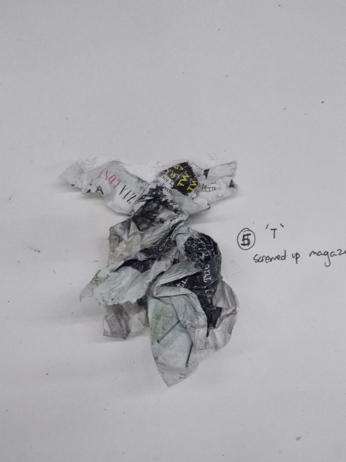
These Photograph were taken by me
I used my camera to take a photograph of my hand to work on loosely. This is something I felt was important because it will be my hand that will build my future. I used my right hand because this is my strong hand and the hand I use to design and therefore makes sense to use,
This Photograph was taken by me

This Photograph was taken by me
Here you can see the logo for the V&A to add to the bottom of the poster to fit the brief. As well as this Victoria and the Albert Is one of my favourite museums and I would love to have an exhibition here in twenty years.
This Photograph was taken by me
The top two photographs you can see the watercolour drops, this is a very loose way of working and allows me to be open to accidents. Below this shot you can see the drops of the watercolour onto my sketchbook, I really like this accidental droplets this is something which I really like because I didn't know I would use this but it looks really pretty and could lead to another poster.

This Photograph was taken by me

Above you can see the final version of my poster, the different elements of the poster are simple yet I think work really well. I like the way the paint runs down the poster impacting the composition of the hand. The watercolour sums up the different elements of my future- the dripping of the paint symbolises the motion of my future a course I am thinking of taking for degree (motion graphics). Furthermore the paint from the wrist almost seems like blood but it was meant to emphasise the creativity in my blood. Using the drips of paint is something I have done a lot and I wanted to enhance this element of my work. The only thing I had a challenge with was adding type even on the newer poster with my name on I do not like it. If I could redo it I would explore more ways to do the type or use existing typography.

Thursday, 3 October 2013

Graphic Exploration Day 2- Using typography

All these Photographs were taken by me
Above you can see three images. After the type task we were given another task that used existing fonts. I used Helvetica to create the pencil designs above, using the light box I was able to trace over the type and play around with composition and design. I really like the first design above. I decided to use the word Victorious because this is a word that will define my future self. In order to work with this word I decided to overlay an A on the O to play on my own name 'Victoria'. This is something quite powerful I think because it incorporates myself with my future. Below it you can see how I tried to play around with mirroring my future with my own name again being quite playful with type composition.

The two design above was created by me with Adobe illustrator I wanted to explore creating the initial ideas into a digital version. This meant I was able to see how I could present the design for a real purpose such as a logo or used on a website. I think this was a big factor to think about because typography has come so far and vital In the translation of Graphic and Design in general.


Graphics Exploratory Day 2- Typography

This Photograph was taken by me
Above you can see the components I will be using in order to create the type. Using the watercolour I will paint onto the stapler and print the shape left. This should recreate my original mark making experiment 'H'. When I did the original letter for the experimentation I was just trying to play around with making marks i really liked this method as it was


Above you can see the finished type I created after the experiments, I am really pleased by the finished creation and it surprised me how much I enjoyed it because usually I typography isn't my strong area. Yet this piece is really good because of the way all the letters go together like they should. I like the way all the letters are unified, but especially what sense I get from the letters. During the task Simon one of the tutors asked me what do I think the letters mean or show. I responded saying they reminded me of ivy and nature, he liked this stating yes they are quite beautiful but they reminded him of swamps and monstrous type. I think we are both right the type is disgusting in a beautiful way which is really interesting. I like the colour I chose as well because it goes well with what it represents.  

Graphics Exploratory Day 2- The Experiments


Here you can see three different methods that I carried out when experimenting with mark making. I used the black bit of the glue to roll onto paper because of its texture. You can see the effect of this below. Another method I used was the nails I decided to scratch paint onto the paper with my nails to create a sharp mark making method. The first picture above shows my sketchbook, taped to my pencil case, taped to my ruler, taped to a pen and willow charcoal. I though this would create a really loose mark however it was really controlled and therefore was not as free as I would have liked it. Doing this exercise did make me appreciate what I was doing and learning. I was able to really understand just how important it is to really take forward experiments that work well and continue working on the harder. I think I was successful in these experiments because consequently I was able to create effective Type from one of the experiments that worked well. I liked the looseness of working and will defiantly be considering working like this further to fuel more ideas.


Close up image of my experiments.


This creation was created by dropping watercolour and blowing. Luckily it created a 'W' look which allowed me to think how I could represent the different letters. I think the way that this mark is accidental it makes it even better because it showed I wasn't scared if it messed up. I allowed the watercolour to be quite free and when I blew on it I didn't hold back I just went for it. This created something quite effective, perhaps I could play around with the different colours.


Monday, 30 September 2013

Graphics Exploratory Day 1-Collage and painting

Collage in Progress.
Using Emily Davidson a feminist who died trying to get women the freedom to vote was the basis of my collage. I think that it is defiantly important to appreciate the sacrifice Davidson and many suffragettes went through in order to give woman in Britain the same rights as the male equivalent. I feel that using Davidson will give me a strong foundation to create something powerful.
 

Finished collage
Above you can see a collage I created in class using little triangles of different sections of people's faces. I decided to use Emily Davidson as the foundation of my collage because of the strong female power which radiates from her being. I went on to add other famous women such as the queen and other Olympians. The triangle has been used a lot throughout my weeks and therefore is really fitting here. I like the way the other pieces join up but yet still creates an abstract look. I really like collaging at the effect it gives once it is complete I am going to create another image like this. The next stage after this creation is to make a painting using a viewfinder which in turn will create another design. If I could change this in anyway I would try to abstract it more so it looked not like a human, however I still think it is successful because it is really interesting to look at and it makes you want to focus on the different parts of the faces. Furthermore another thing which I would change if I could would be perhaps taking away the flowers from the hat as I feel they do not do that much for the collage and takes away from the actual face.


Image of the viewfinder section of my collage which I am going to paint
Above you can see the painting I used with the viewfinder as my guide. You can see with the collage next to the painting the scale of the painting in comparison to the small section I chose to paint. I like my finish painting- however if I could  change anything I would most likely like to choose a more abstract section of the face in order to make a more effective and abstract painting. However all in all I think my panting is really successful and allows me to transform the meaning of the collage completely infact it has transcended into a different image completely. The challenge which I faced when creating this piece was trying to blend and paint efficiently. This was because I had not painting in several months and forgot how to carry out painting once I got into it however my piece was able to form until the finish piece was complete.
 

Graphics Exoploratory Day 1 The drawing exercise

Drawing with our eyes shut 
To the left you can see one of my finished drawing, the task was to stare at someone for thirty seconds and then with our eyes closed draw them from memory. It wasn't just the memory fact that was challenging but having our eyes closed and not knowing where our markings were on the page. I tried to overcome this by creating a plotting guide in my head. I actually really like the finished drawing created with willow charcoal. The design does actually bears resemblance to the girl it was meant to do therefore I was really successful in this task. The only thing I was unhappy with was the pair of two eyes but in its own way it looks really interesting. The drawing is really centred something I find hard doing with my eyes open so this really surprised me. If I was going to develop this more I would play about with applying colour or overlaying another portrait in the same way that this one had been created. This could ad another element to the already unique drawing.


Drawing with my left hand
The next task we were asked to do was draw a portrait of someone with our left hand. This is something I have done before so therefore I had a limited amount of experience. The finished piece is to the right. I am really happy with it, at the beginning I was struggling to make harsh enough strokes but the more I did it the more I was able to create the tone I wanted. I used a graphite pencil to make the marks, maybe If I had chose a darker material such as a marker or something like that it would have been more prominent. However the graphite sticks created an elegant look for the portrait which is really fitting for the person therefore it worked out really well capturing her character. One thing I am not too happy about is the way it is small on the page I wish I could have made the picture a lot bigger to feel the page. Overall I really like this piece and using my left hand is something I am going to consider more of in my work.
Drawing with the pen in my mouth
This was a task I had never done or ever thought of doing so at the beginning it was really hard to gain control of the pen in my mouth however in the same way as my left hand drawing I got used to working in this way. The drawing was as you can see to the right is rather wobbly and even quite square at some points, however I did draw a resemblance to the girl I was meant to and therefore this means I was successful. If I could carry on with this piece I would spend more time making the marks. However as my first time ever doing this I am really pleased and really enjoyed the exercise. I feel I was successful because I drew likeness to the portrait, the medium that I used here was a black felt tipped pen which made the bold marks.


Continuous line self portrait
To the right you can see a self portrait that I did using a red felt tipped pen a really bold colour. I wanted to make the design stand out so I chose this colour. I have down continuous line a lot but I don't like this picture I did, if I could redo it I would make it a lot more loose and perhaps add more detail in some places. I didn't get to finish the hair however a lot of people gave me positive feedback and said it looked like me a lot. However because I do not like this piece I am going to redo the piece with a longer time frame as well to see how I can improve the technique. I really like the eyes however on the drawing as they are really striking.


Above you can see an ear which we did of the person next to me. The green one was me I created this using felt tipped pens and water, I love the mix of the medium and it worked really well. If you look at the green ear the one I did you can see it is one of the brightest however it gets lost in the other ears because it is really small. I did realise this when I did the drawing to begin with however it was too late for me to redo the ear. Other than this I am really happy with the ear, the exercise let me realise how I could focus on something you don't really think about.

A video showing me carrying out two of the drawing exercises.

Summary of the week 3D Exploration week

This week revealed quite a lot for me. After doing the week I have realised that the 3D Pathway isn't for me. Although I found all the task really fun and thought provoking I did not get the same connection I did with the other courses therefore I feel this week has been really helpful in helping me discover what I will be doing in the near future. All the tasks that I carried out was really interesting and very hands on throughout the tasks there were many obstacles and I had to think carefully what to do especially the tasks we didn't had to design. I did find certain tasks harder for instance creating the bottle holder because I had never before thought/seen a way to support a bottle before. Although I liked all that I made not all of the things I created  was functional and performed the tasks that they were meant to. If I could re work these outcomes I would be able to see where they went wrong and improve it.

During the task process I received a variety of comments from staff and student. Some were positive and others realistic allowing me to look more in depth at a task I was doing at the time. This was most obvious when I was trying to build a structure for two people with another  student. The tutors and students doubted the way it stood which in turn made me and my partner think about how we could physically look better. During the bridge making task the tutor really liked my idea of making a mechanical lever that would allow the bridge to  come up and down via a twist motion.  Because of his enthusiasm and interest it did pushed me further to see how I could best demonstrate this- In the end it was successful.

I think that the bridge that we created in class was successful because it was different from all the others in the class. We were the only ones to try a multifunctional bridge that went up and down. On top of that many of the class and even some of the tutors didn't think our bridge would work and when it did it made us feel proud of what we had accomplished. The spaghetti construction was more successful than my other creations because I feel I had more time to plan and sketch ideas. Certain aspects that I was not really happy with was the bottle holder at the beginning of the week  because I had no idea how to start the project and wasted time thinking instead of doing. This is something I need to consider when carrying out time management.

Because of  the challenges I have faced and outcomes I have produced I have gained a much greater understanding on how to think about a construction and human interaction with a product. This is something which is needed throughout  the pathway and therefore is a really important piece of knowledge.  The second thing I have learnt from my week at the 3D Pathway was the concept to design things using random inspirations such as a squiggle or dots. This was the first time I had ever carried out anything liked this and proved very helpful. It fuelled ideas and was a fun way to propel ideas when you can not think of anymore. Collaboration was another thing I learnt this week during the bride building  and chair support tasks. I was able to interact with other students and see how we were able to come together and think of different ideas. This is something I will defiantly be  using in the future and therefore was a good experience.